
table of contents
The iPhone single-handedly brought about a revolution that literally “changed the world”. Overnight, hordes of apps started to swarm the newly created app stores and created a whole new ecosystem that thrives on mobile apps. With the advent of Android, this competition got intense and ushered in an era where apps competed for supremacy in their own, newly created domains.
The world of mobile apps is extremely unforgiving and it takes hours for an app to lose its position on the top charts. Apps today are judged by users based on features, user-friendliness, and an overall user experience that can affect popularity and adoption rates. The deciding factor for most individuals today is the overall user experience of an app. With hundreds of variants and clones around, it’s easy to pick and choose from the options available in the marketplace today.
When it comes to music, the world of apps and the experiences they offer are as diverse as the number of apps, however, of all known apps around two of them rule the roost and have been in a constant battle for higher adoption rates—Spotify v/s Apple Music. With devoted fanbases and a long, protracted history of trying to one-up each other for supremacy, the choices their users have made have not just been because of the music on offer—it has been on usability and the user experience that these apps offer.
The Apple Music and Spotify feud has been on since Apple acquired Beats Music in 2014 and launched it as Apple Music in June 2015. With artists switching sides, lawsuit threats, and plots to enhance revenue, both platforms have fought for user share since their launch and continue to do so till today.
Without further ado, let us go through the user experience and see how these two behemoths differ. Here begin the battle – spotify V/s Apple music:
-
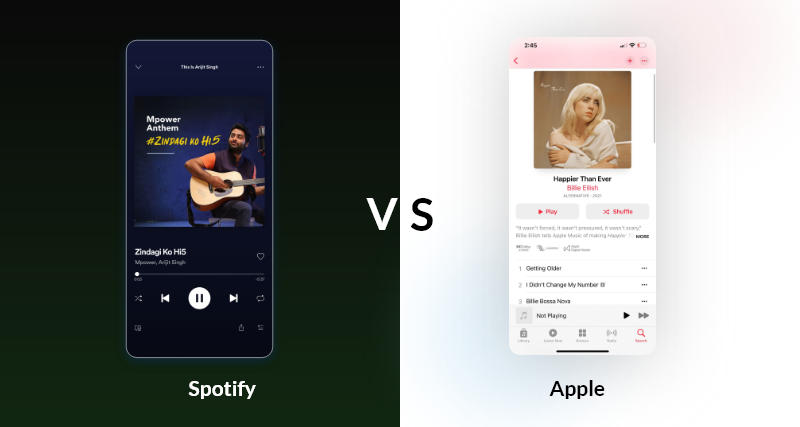
The music player
Spotify wins!
The music player or the player is the most important part of any music app. While Apple music chose a white background that showcases album art, Spotify has gone in for a dark UI with white text. Spotify offers users more controls on the UI, with the skip, play, shuffle and repeat being on the same interface. Here’s our guide to creating a music streaming app like Spotify.
They have accomplished this by wisely removing the volume rocker, as most people will adjust the volume from the physical buttons on their phones. When it comes to the number of taps needed to reach the artist page of the song that you’re listening to, Apple takes two taps while Spotify needs two taps and a scroll for the same job.
-
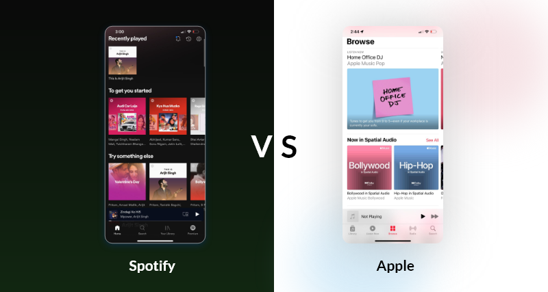
The home screen
Winner: Tie or user preference
If you’re someone who wants to use music to set the mood or create an ambiance, Spotify would be the way to go. With the user’s library going all the way to the bottom and the top list being covered with curated playlists, Spotify has it covered for those who want variety and options in music.
Apple relies on obsessive music lovers who want their personal library to be available to them at all times. This is very similar to the design of how the iPod served music to users, with their libraries being available first, and the new stuff came later.
-
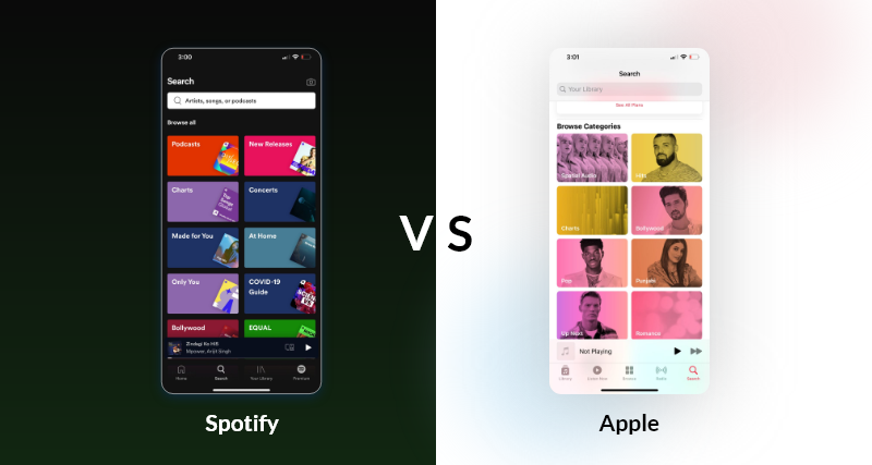
Finding new music
Winner: Spotify!
Although the music discovery algorithms of both platforms prioritize music differently, they have features that are designed to help users find what they like from the millions of songs available on both platforms. Both interfaces employ machine learning-driven interfaces that improve with usage frequency and time.
Spotify’s discovery page has been showcased, discussed, and appreciated for its world-class user experience dozens of times. With its Discover Weekly feature that compiles a playlist according to your taste, it inspired the UI of Google’s streaming music service!
Apple’s algorithm is very user-centric. Weighing its recommendations based on the genre preference of its users, Apple’s selection is wide, but the user interface is lacking. With downright annoying circles that you need to click while they bounce around the interface, it becomes a chore to pick the ones you like.
Our verdict:
Although both these platforms offer a massive selection of music, world-class discovery features, and libraries, the user experience of Spotify manages to trump Apple’s iPod-inspired UI by a huge margin.
Spotify’s dark interface, feature-laden music player, and outstanding discovery feature helps it get the 286 million monthly active users that the platform has. Although Apple’s UX is no slouch and has also been adopted by millions of users who consider it the best of the roost, it all boils down to personal preference and what you really want from your music app! The choice is yours!


Evinizde hem s?kl?g? hem de kullan?sl?l?g? onemseyenler icin harika ipuclar? derledik.
Зацепил раздел про Yeni Moda Trendleri ve Stil Ipuclar?.
Вот, делюсь ссылкой:
https://siktarz.com
Gelecek yaz?lar?m?zda bulusmak uzere, dekorasyona dair en iyi fikirlerle burada olacag?z.
Dekorasyona yeni bir gozle bakmaya ne dersiniz? Hem estetik hem de islevsellik on planda!
Особенно понравился раздел про Atasehir’in En Iyi Bal?k Restoranlar? ve Lezzetli Tarifler.
Вот, делюсь ссылкой:
https://tarifkasif.com
Bu yaz?m?z isinize yarad?ysa, goruslerinizi bizimle paylas?n.
Bu yaz?da, evinizi guzellestirirken islevselligi de art?rman?n yollar?n? kesfedecegiz.
По теме “Yeni Moda Trendleri ve Stil Ipuclar?”, есть отличная статья.
Вот, делюсь ссылкой:
https://siktarz.com
Umar?z bu ipuclar?yla evinizde harikalar yaratabilirsiniz! Sevgiyle kal?n.
Bu yaz?da, evinizi guzellestirirken islevselligi de art?rman?n yollar?n? kesfedecegiz.
По теме “Modern Dekorasyonla Estetik ve Fonksiyonellik”, нашел много полезного.
Смотрите сами:
https://dogalyasammobilya.com
Umar?z bu ipuclar?yla evinizde harikalar yaratabilirsiniz! Sevgiyle kal?n.
Evinizde hem s?kl?g? hem de kullan?sl?l?g? onemseyenler icin harika ipuclar? derledik.
Хочу выделить материал про Atasehir’in En Iyi Bal?k Restoranlar? ve Lezzetli Tarifler.
Ссылка ниже:
https://tarifkasif.com
Umar?z bu ipuclar?yla evinizde harikalar yaratabilirsiniz! Sevgiyle kal?n.
Dekorasyona yeni bir gozle bakmaya ne dersiniz? Hem estetik hem de islevsellik on planda!
Между прочим, если вас интересует Turk Mutfag?nda Ask ve Tutku: Yenilikci Tarifler, посмотрите сюда.
Смотрите сами:
https://yemekruhu.com
Evinizi guzellestirmek icin farkl? yaklas?m ve fikirlerle geri donecegiz.
Evinizde hem s?kl?g? hem de kullan?sl?l?g? onemseyenler icin harika ipuclar? derledik.
Зацепил материал про Ev Dekorasyonu: Modern ve Fonksiyonel Cozumler.
Смотрите сами:
https://evsahnesi.com
Evinizi guzellestirmek icin farkl? yaklas?m ve fikirlerle geri donecegiz.
Dekorasyona yeni bir gozle bakmaya ne dersiniz? Hem estetik hem de islevsellik on planda!
По теме “Lezzet Dolu Tariflerle Ask Dolu Mutfak Maceralar?”, есть отличная статья.
Ссылка ниже:
https://sevgiylepisir.com
Umar?z bu ipuclar?yla evinizde harikalar yaratabilirsiniz! Sevgiyle kal?n.
Dekorasyona yeni bir gozle bakmaya ne dersiniz? Hem estetik hem de islevsellik on planda!
По теме “Renkli ve Lezzetli Tariflerle Hayat?n?z? Renklendirin”, есть отличная статья.
Вот, делюсь ссылкой:
https://evtarifim.com
Umar?z bu ipuclar?yla evinizde harikalar yaratabilirsiniz! Sevgiyle kal?n.
Bu yaz?da, evinizi guzellestirirken islevselligi de art?rman?n yollar?n? kesfedecegiz.
Между прочим, если вас интересует Lezzet Dolu Tariflerle Ask Dolu Mutfak Maceralar?, посмотрите сюда.
Вот, можете почитать:
https://sevgiylepisir.com
Evinizi guzellestirmek icin farkl? yaklas?m ve fikirlerle geri donecegiz.
Estetik ipuclar? ve fonksiyonel mobilyalarla evinize yepyeni bir soluk getirmeye haz?r m?s?n?z?
По теме “Ev Dekorasyonu: Fonksiyon ve Estetik Ipuclar?”, там просто кладезь информации.
Вот, делюсь ссылкой:
https://cilginmobilya.com
Gelecek yaz?lar?m?zda bulusmak uzere, dekorasyona dair en iyi fikirlerle burada olacag?z.
Dekorasyona yeni bir gozle bakmaya ne dersiniz? Hem estetik hem de islevsellik on planda!
Кстати, если вас интересует Stil ve Moda Onerileri: S?kl?k ve Kullan?sl?l?k, загляните сюда.
Ссылка ниже:
https://stilvezarafet.com
Gelecek yaz?lar?m?zda bulusmak uzere, dekorasyona dair en iyi fikirlerle burada olacag?z.
Bu yaz?da, evinizi guzellestirirken islevselligi de art?rman?n yollar?n? kesfedecegiz.
По теме “Lezzet Yolculugu: Tarifler ve Ipuclar?”, нашел много полезного.
Вот, делюсь ссылкой:
https://ascieli.com
Evinizi guzellestirmek icin farkl? yaklas?m ve fikirlerle geri donecegiz.
Modern dekorasyonla estetik ve fonksiyonelligi nas?l birlestirirsiniz? Bu yaz?da kesfedin.
Для тех, кто ищет информацию по теме “Sagl?kl? ve Lezzetli Hayat Ipuclar?”, там просто кладезь информации.
Вот, делюсь ссылкой:
https://mutfakkeyfi.com
Umar?z bu ipuclar?yla evinizde harikalar yaratabilirsiniz! Sevgiyle kal?n.
Estetik ipuclar? ve fonksiyonel mobilyalarla evinize yepyeni bir soluk getirmeye haz?r m?s?n?z?
Для тех, кто ищет информацию по теме “Moda Dunyas?nda One C?kan Trendler ve Stil Ipuclar?”, там просто кладезь информации.
Смотрите сами:
https://turktekstil.com
Bu yaz?m?z isinize yarad?ysa, goruslerinizi bizimle paylas?n.
Modern dekorasyonla estetik ve fonksiyonelligi nas?l birlestirirsiniz? Bu yaz?da kesfedin.
Особенно понравился раздел про Turk Mutfag?nda Ask ve Tutku: Yenilikci Tarifler.
Вот, можете почитать:
https://yemekruhu.com
Evinizi guzellestirmek icin farkl? yaklas?m ve fikirlerle geri donecegiz.
Merhaba dekorasyon severler! Estetik ve islevselligi bir araya getirdigimiz mobilya cozumlerine hos geldiniz.
Особенно понравился раздел про Sagl?kl? ve Lezzetli Hayat Ipuclar?.
Ссылка ниже:
https://mutfakkeyfi.com
Daha fazla dekorasyon onerisi icin bizi takip etmeyi unutmay?n!
Merhaba dekorasyon severler! Estetik ve islevselligi bir araya getirdigimiz mobilya cozumlerine hos geldiniz.
Кстати, если вас интересует Modern Dekorasyon ve Mobilya Secimi: Ipuclar? ve Trendler, загляните сюда.
Смотрите сами:
https://modernsturk.com
Daha fazla dekorasyon onerisi icin bizi takip etmeyi unutmay?n!
Merhaba dekorasyon severler! Estetik ve islevselligi bir araya getirdigimiz mobilya cozumlerine hos geldiniz.
Особенно понравился материал про Yeni Moda Trendleri ve Stil Ipuclar?.
Смотрите сами:
https://siktarz.com
Bu yaz?m?z isinize yarad?ysa, goruslerinizi bizimle paylas?n.